Helen Tubb Consulting
Client: Helen Tubb
Brand Identity, Website Design
When you spend 30+ years navigating corporate life, chairing executive tables, and coaching leaders across the globe, you don’t exactly need a flashy brand to prove you know your stuff. What you do need? A brand that can sit confidently in a boardroom, while still reflecting the very human, witty, and approachable personality behind the name.
Helen’s work is about sponsorship — that subtle, powerful lever of advocacy that propels careers and transforms leadership cultures. It’s a serious subject, with real consequences for companies who ignore it. But Helen herself? She’s warm, sharp, and disarmingly clear. The challenge was to create a brand and digital presence that carried both truths: serious authority without being sterile.

The Brand
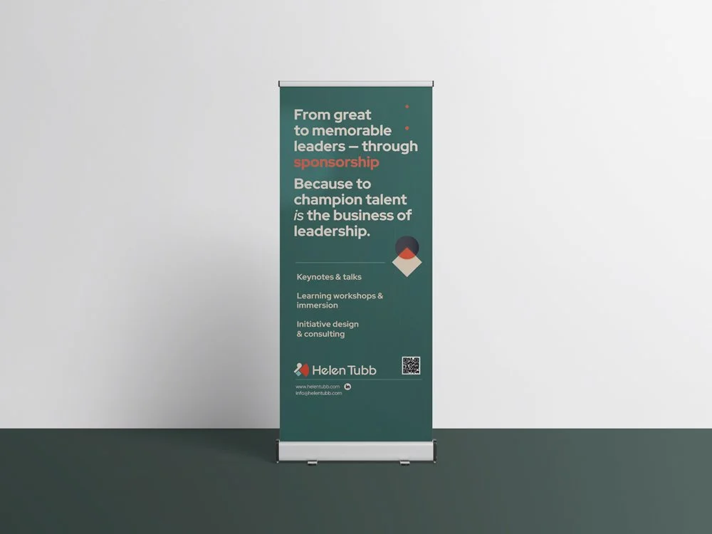
Authority doesn’t have to mean boring. Helen’s brand system was designed to project credibility and gravitas in the corporate landscape she operates in — with clean structure, strong typography, and a restrained palette. But beneath the professional polish lies personality: a human voice, sparks of colour, and space for Helen’s perspective to shine through.
The result? A brand that could open doors at the C-suite, while still letting her audience feel like they’re meeting Helen — not a faceless “leadership consultant.”
Design Details
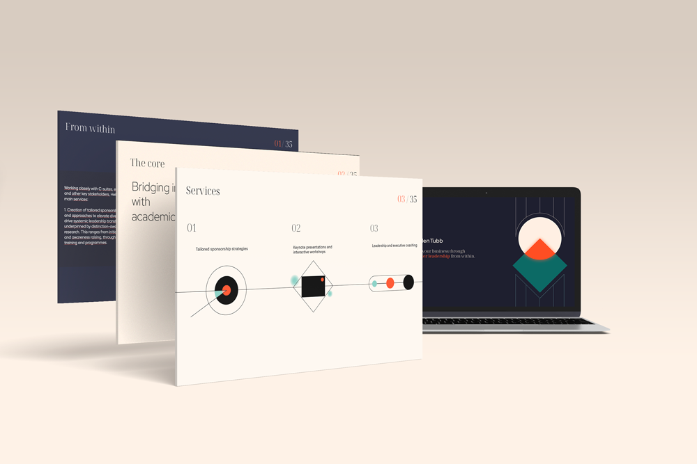
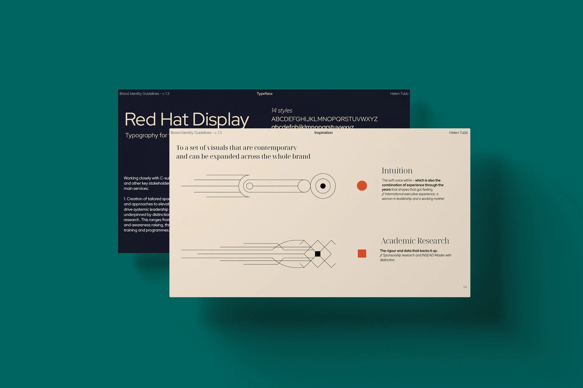
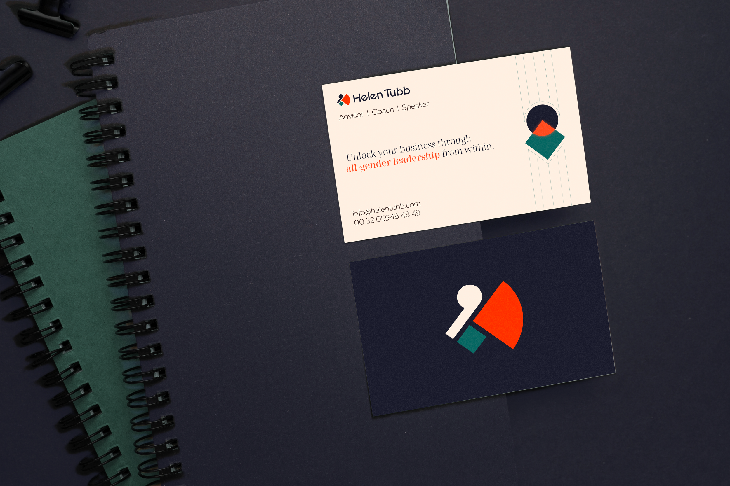
Typography: A strong, modern serif anchors the brand with gravitas, paired with a clean sans-serif for clarity and accessibility. Together, they balance “corporate confidence” with contemporary warmth.
Colour Palette: Muted blues and deep neutrals deliver authority and trust, while accents of softer tones add approachability. Serious enough for the boardroom, never too stiff for Helen.
Illustrations: A series of clean, minimalistic abstract illustrations were developed — not to oversimplify or cliché hard concepts, but to support them with elegance. Sponsorship isn’t easy to “draw,” and we didn’t try. Instead, the illustrations act as subtle cues: guiding, contextual, never distracting.
Logo: The logo is a geometric, art deco–inspired swan. Symbol of grace and strength, it works less as a literal image and more as a personal totem for Helen — a quiet emblem of who she is and how she leads. Not meant for everyone to “get,” but meant for Helen to own.
Layout: Space was treated as a luxury — open, clear structures that allow her words to breathe and her ideas to shine. No clutter, no noise, just focus.
Tone of Voice: Professional, yes, but also human. The copy avoids jargon, leaning instead on Helen’s clarity and warmth — the very traits that make her such an effective advisor and speaker.
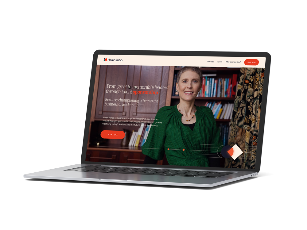
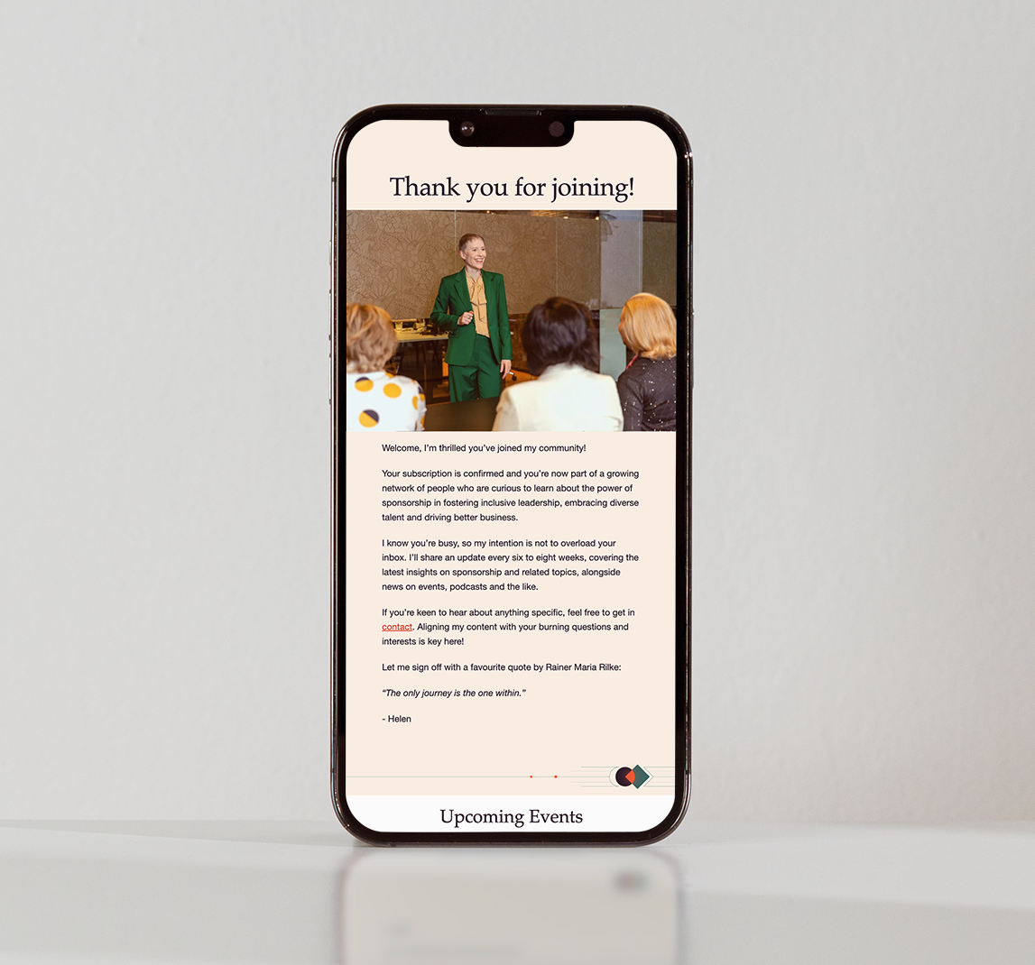
The Website
The website extends the brand into a digital environment that’s clear, confident, and purposeful. No unnecessary frills, no “coaching clichés.” Instead, the design foregrounds her expertise: her INSEAD research, her international client work, her unique angle on sponsorship.
Navigation is simple. The messaging is sharp. Visitors get the sense that Helen knows exactly what she’s about — and exactly how to help.
And importantly, it feels alive. The site reflects her ability to engage an audience — whether that’s through a keynote, a workshop, or a one-to-one conversation.
The Impact
Helen’s new brand and website now sit comfortably at the intersection of authority and humanity. It feels “serious” enough for corporate leaders and Boards, while never losing the spark of personality that makes Helen, well, Helen.
This project proves what we believe deeply: a personal brand can be authoritative and authentic at the same time. It doesn’t have to choose between professional polish and true self. Done well, it can do both. That’s where the magic happens.