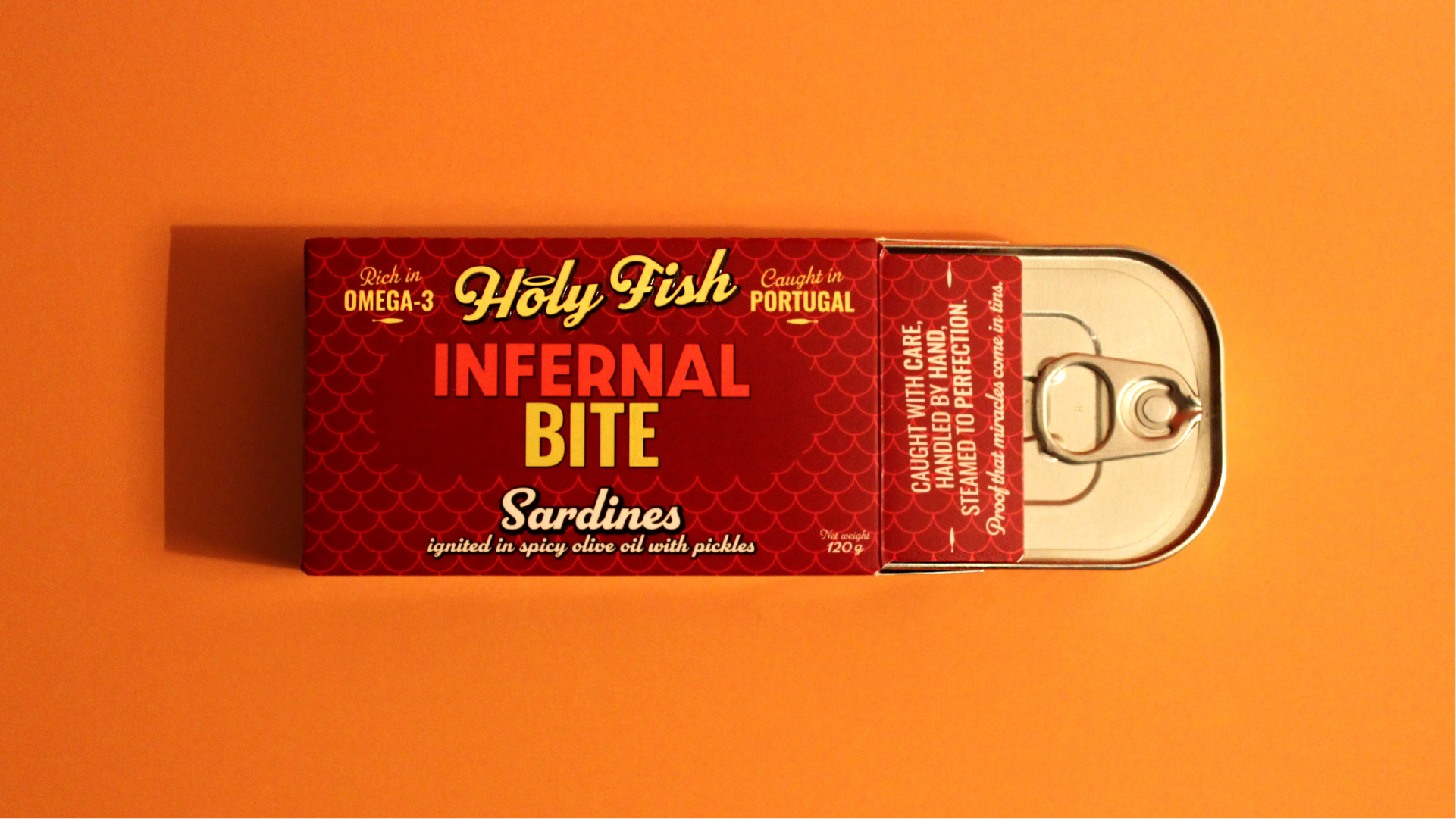
Holy Fish
Proof that miracles come in tins
Client: Holy Fish
Agency: NUTS Branding
Creative Director: Patricia Conde
Account Manager: Dina Tavares
Holy Fish was born from a brief that was simple yet ambitious: to create a Portuguese tinned fish brand from scratch, built for export, with its own identity and a disruptive image that would set it apart from others in its category. In the first phase, the priority was strong appeal in the digital space, where the packaging needed to make an impact on a foodie audience accustomed to browsing e-commerce platforms — and later, to stand out on shelves alongside competitor brands.
The client wanted a brand that could speak to this discerning consumer without relying on the craft and traditional imagery that dominate packaging in this category. The challenge was to create a visual language that was simultaneously irreverent and coherent — a new visual voice for Portuguese tinned fish in international markets.
The starting point was a simple observation: religion is humanity's greatest system of visual and emotional communication. For centuries it has shaped collective imagination, created symbols, and established a language that everyone recognises — even non-believers. And it never disappeared. It transformed itself into pop culture. Madonna, FKA Twigs, Dolce & Gabbana, and many others drew on this energy to create something simultaneously irreverent and transcendent. Holy Fish does the same: it appropriates the sacred to elevate the everyday.

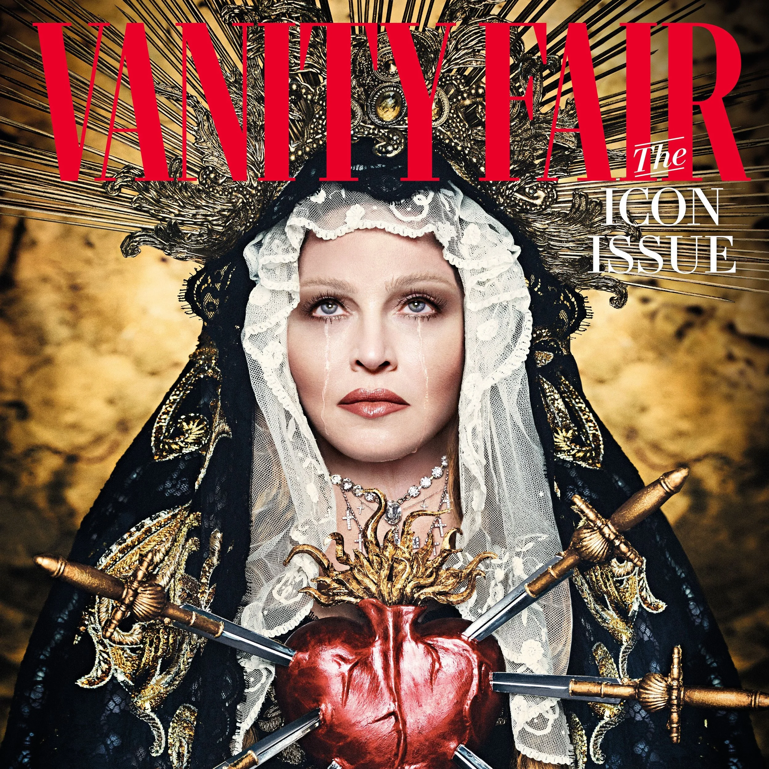
@Dolce and Gabbana
Madonna @ Vanity Fair magazine
A tin that is not just food, but a piece of culture.
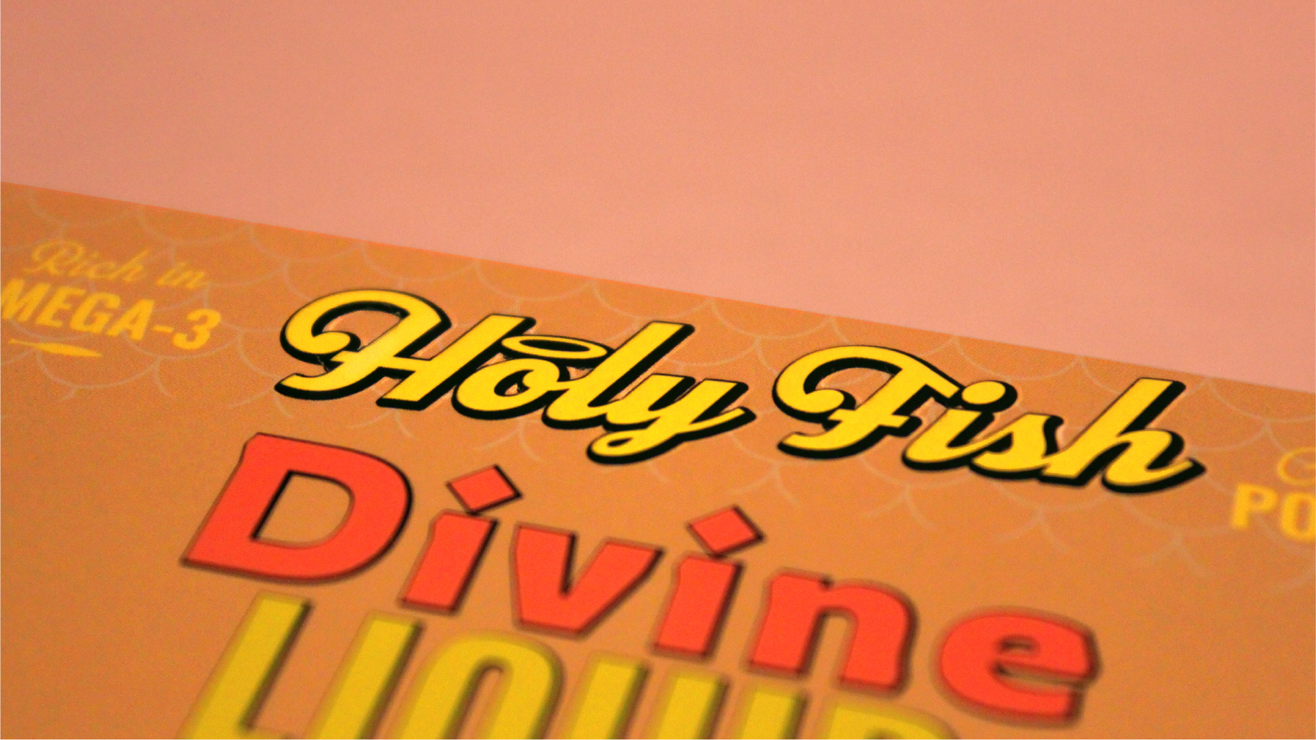
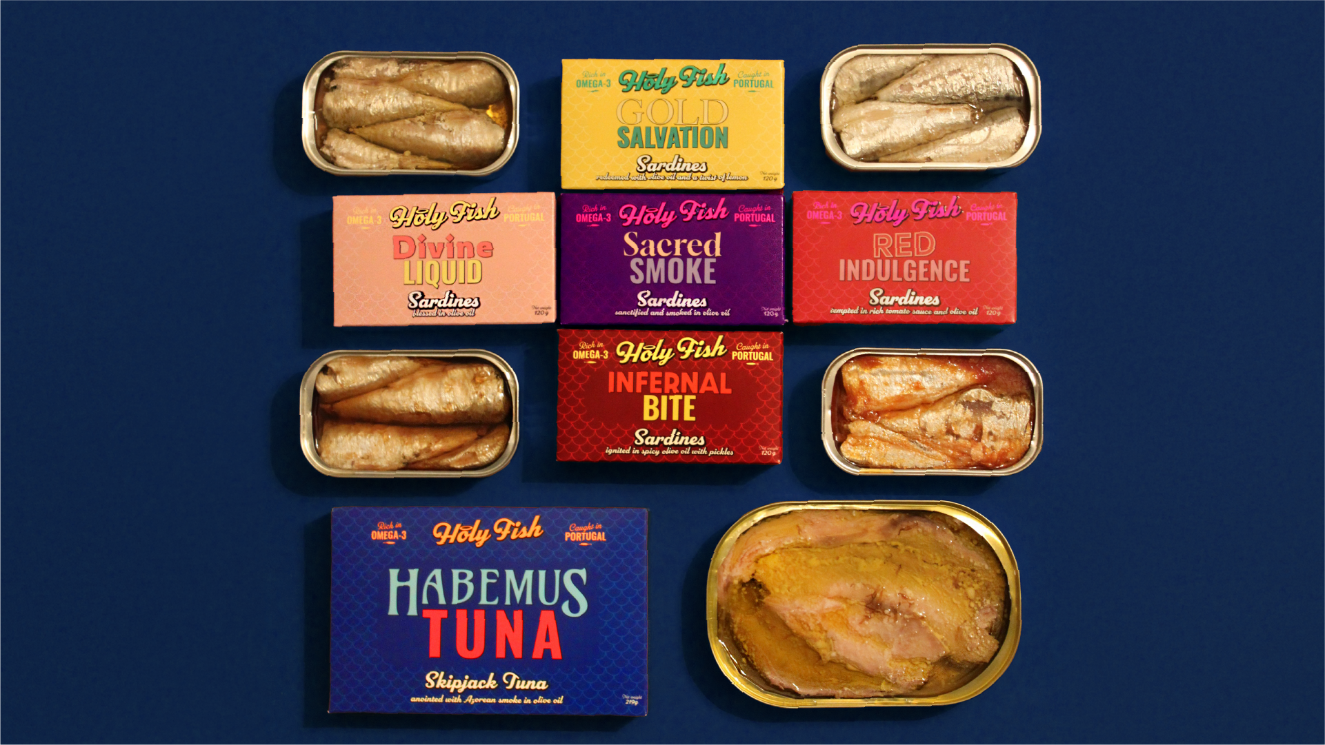
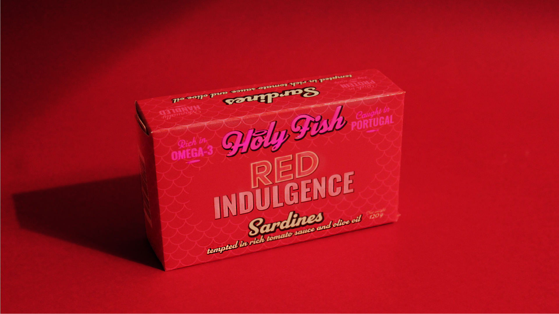
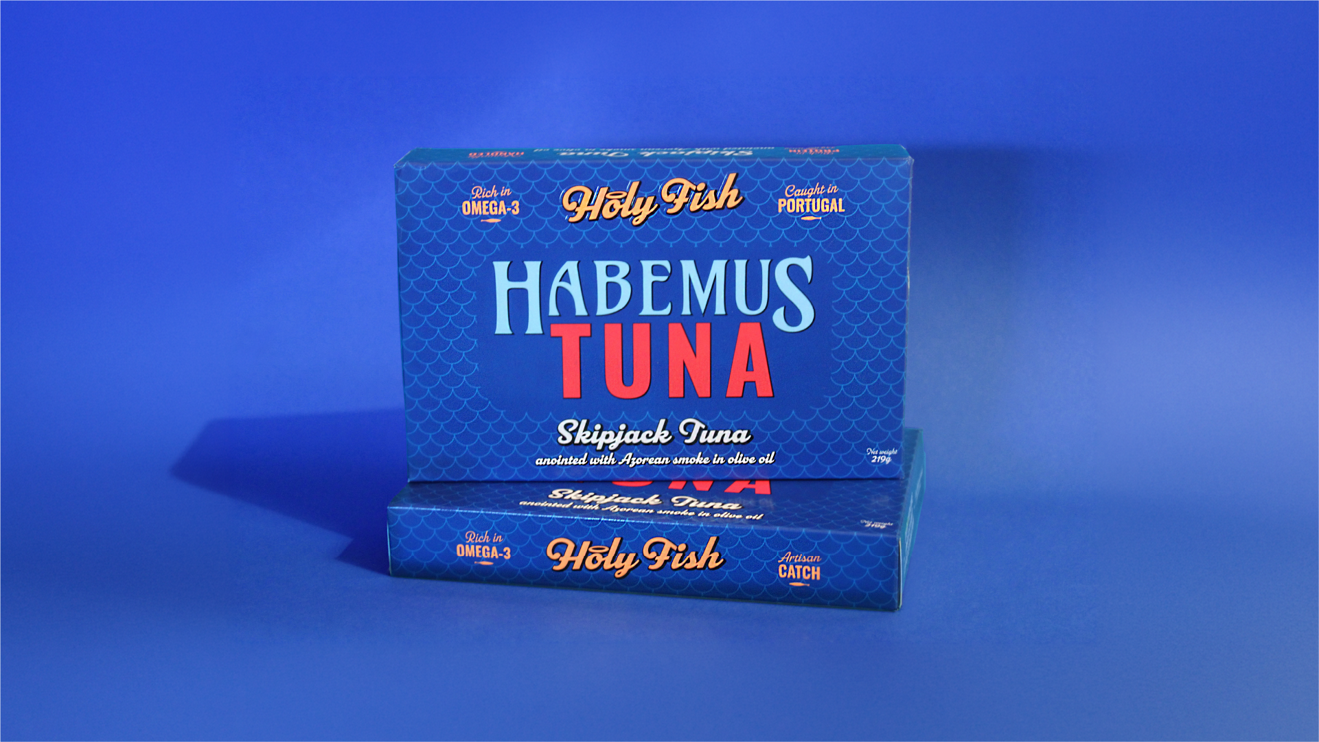
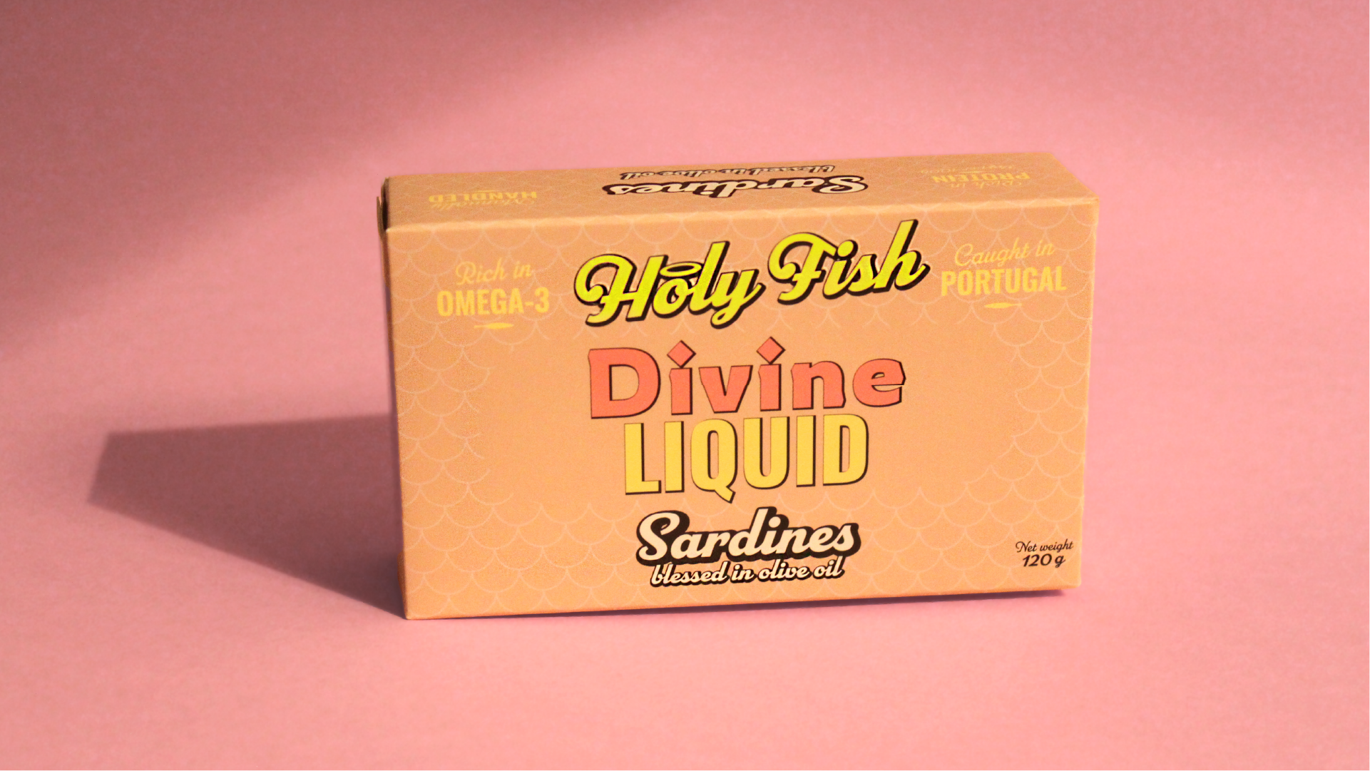
The name was the first major insight. Holy Fish is an exclamation. "Holy fish! This is so good!" — it works as a genuine reaction to the product and as a brand manifesto at the same time. The tagline "Proof that miracles come in tins" sets the tone: ironic, confident, with flair. The recipe names complete the narrative system: Gold Salvation, Divine Drop, Red Indulgence, Infernal Bite, Habemus Tuna, Sacred Smoke. These are not product names — they are direct expressions of the eating experience. A sardine can be so good it feels like a miracle, or so delicious it becomes a temptation. This tension between the sacred and the sinful transforms every tin into an experience before it is even opened.
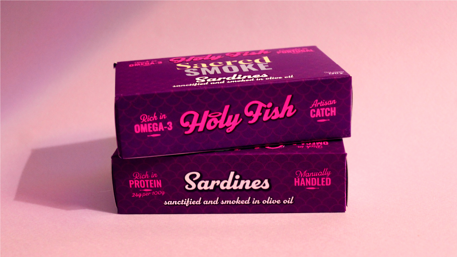
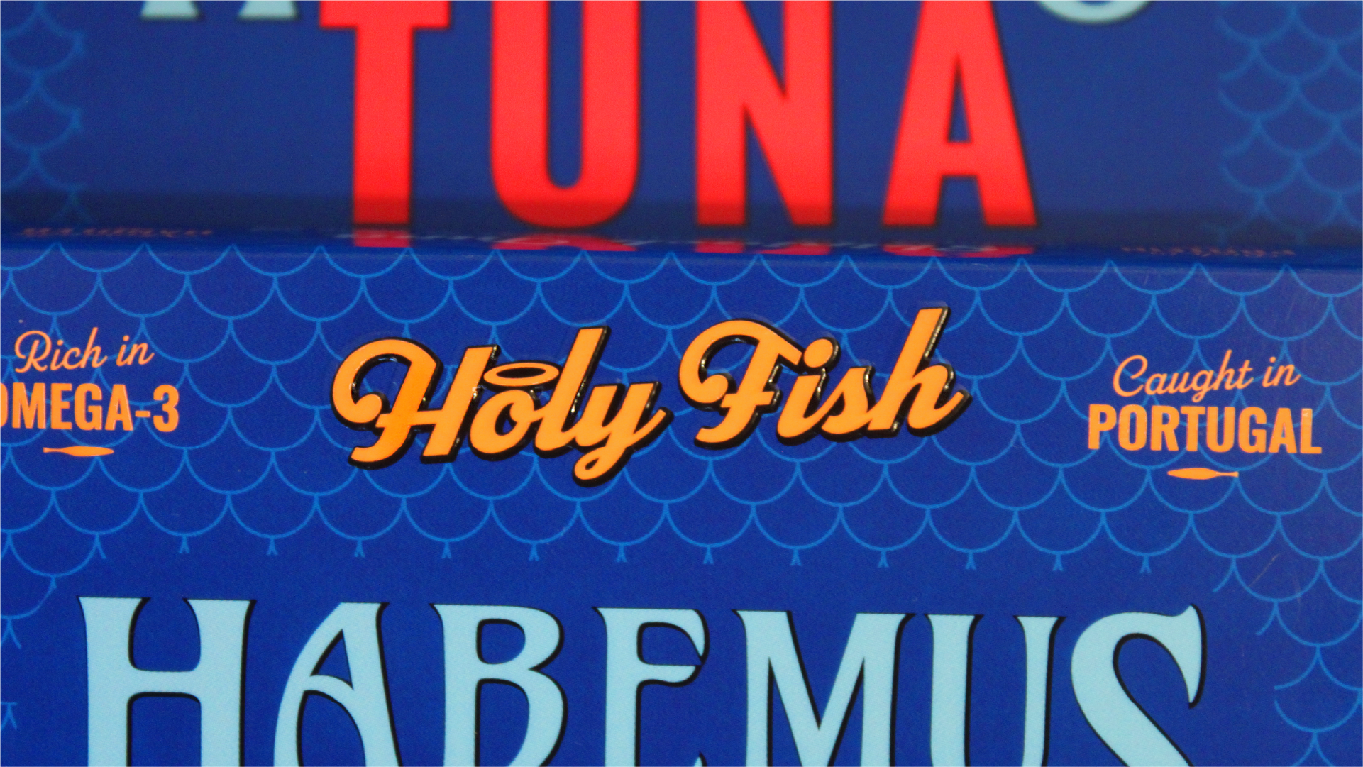
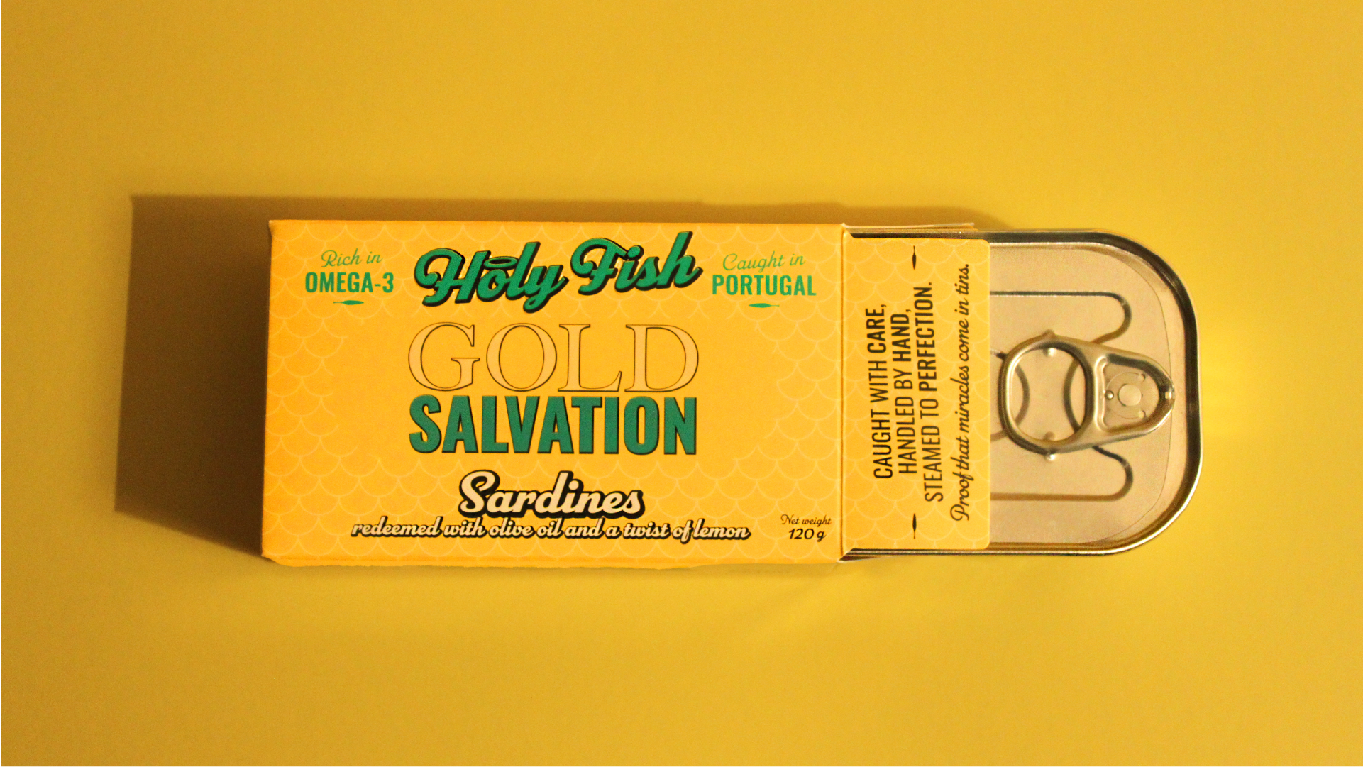
The most radical decision was the all-type design. In a category dominated by fish illustrations and traditional visual references, Holy Fish shows nothing — it says everything. This choice avoids any association with a specific religion, keeping the concept on universal ground, whilst creating blocks of colour that function as autonomous graphic objects — just as striking in product photography as on a shelf. The aesthetic reference comes from fashion: baroque and rococo reinterpreted by fashion designers, and the theatricality that transforms an object of consumption into an object of desire.
The CMYK printing with a neon Pantone application on the logotype was a precise technical decision — the neon is not a decorative detail, it is the signature that ensures Holy Fish stands out even in the most visually saturated environments.
Holy Fish is now entering the market, with an initial launch on Amazon and other e-commerce platforms. The brand was built from the ground up to create disruption, and the packaging is its first and most powerful argument — and the primary means through which the product's experience and benefits are communicated.